October 13, 2004
I need feedback
A month ago I saw the picture below taken by a spanish journalist/blogger who was in NYC on Sept. 11th and went to pay his respects at Ground Zero. He took this picture which I love and asked if I could have a copy to add the image to my site. I still love the image and use it as my screen saver at work. However, I'm now wondering if it just might be too dark to have it on the top position in the upper right corner of my blog.
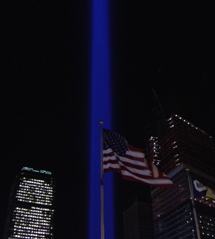
What do you think?
It isn't so much that the picture is dark; I like the blue light against the black sky, but I would like to see the flag better. There may be ways to brighten the flag a bit.
Posted by: Rachel Ann at October 13, 2004 12:23 PMI love it! As is.
Posted by: Laughing Wolf at October 13, 2004 06:59 PMI like it too, but I suggest that you add a white border around it if you add it to the top of the page.
Posted by: Johnny - Oh at October 13, 2004 08:07 PMI like it. A lot. I also like the idea of a white (or possibly the same shade blue) border. That would seperate it from the background better and help it to "pop".
But yeah - it's a stunning photo. I can see why you love it.
Posted by: Tammi at October 14, 2004 11:28 AMGreat pic, and I agree on the notion of a white border.
Still, it couldn't hurt to run it through a photo editor program and try boosting the gamma a little. It may or may not look better lighter, but you might want to check.
Posted by: Harvey at October 14, 2004 12:59 PMI took the liberty of bringing the picture into Photoshop and doing a dynamic range adjustment, and also tweaking the white balance. You can see (and download) the results here:
http://homepage.mac.com/jharrell/lettersfromny.jpg
I'm not saying it's all that great, but it should give you an idea of what's possible.
Posted by: Jeff Harrell at October 14, 2004 02:21 PM